Make an impact : photos, colours and their meaning
Make an impact : photos, colours and their meaning
So, as you may know, one of my passions is photography. And I love taking photos of the city, and the different things I observe. It's a good exercise to understand your own vision of the world, and comprehend that there isn't black and white, only a diverse palette of colours. Once you understand this, your perspective from your every day life and the world as a whole will change for the better. That unique vision can be expressed through different forms of art. In this case, photography


I think this passion was transmitted to me through my dad. He is a great photographer, even if he doesn't consider himself one.

Anyway, he taught
me a lot about this amazing form of expression and I wanted to share with you, more precisely, what I learned about how photos can transmit feelings through colours.
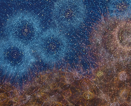
Before we start, this is the camera I used to take most of the photos. It's a sony h300. I drew this camera with the style of Aboriginal art.
But, what exactly is Aboriginal art, and what role does colour play in the creation of one of this art pieces? Ancient Aboriginal art dates from between 60,000 and 80,000 years old, while contemporary Aboriginal art started only a few years back, in 1971. It's based on forms of nature and landscapes from their surroundings, which I think is really interesting, because, in a way, they are connecting with their roots.
There are many Aboriginal art styles, but they are all based in the Dreamtime. The Dreamtime was, basically, the time were the earth was created. They believed their Ancestors, who were supposedly spirits, created all of the rivers, rocks, animals, plants and people on our planet.
This is the Aboriginal art style I chose to draw the image of the camera:
Dot painting
From Central and Western deserts of Australia. It's based off designs of body painting in dance ceremonies, and ground paintings. At first, they used colours related to the desert landscape. After some time they started to develop more brighter colours, as you can see in the first picture


You can see the influences of the dot painting style in my drawing. However, instead of painting it, I decided to colour it with pencils and markers. I tried to combine my style of painting with other communities style's, like the Western Desert communities, which opt for strong primary colours. I chose more contemporary colors, but also respecting some of the patterns I've mentioned.
Importance of colour in Aboriginal art:
At first, Aboriginal people knew what this images symbolized. They had a set of rules to create based on the meaning of the picture, but that wasn't the case with the use of colour or the artistic style. That's why we can find many variants to both of these in the Internet. However, as time passed by, each aboriginal community developed it's own art style and colour use.
These colours went from red ochre, yellow oxide, white clay and black charcoal, to a much wider variety of colours, like greens and greys. On example are the artists of Balgo. This is a small Aboriginal community which started painting with black, brown and yellow during the 1980's, and then decided to introduce new tones, like reds, pinks and blues.

However, some of these artists are conservative and still keep some traditions, like painting their bodies and the sand. Overall, it depends on the community and their expression decisions.
Well, moving on, I'm gonna show you some photos that express sentiments through colours:

Tandil, 2017. It was really thrilling, looking at Jesus in the Monte Calvario, a quiet and beautiful place in which you can see represented the Stations of the Way of the Cross.
I chose this photo because of the variety of colors,
as a way to show life itself (represented by the lighter and darker shades of
green in the background) and union (diversity of colors) . This may symbolize
how a lot of people come together and reflect their colorful stories with
something as simple as rosaries. It's a message so powerful I had to
capture it with a photo.


This are some photos I took during camp in Cordoba. I took them at different heights of the hill but around the same time of day. You can see different shades of blue and green in this pictures.
In the one at the left, the sky is lighter but the grass is darker. This could represent how their feet are conflicted. But that someone can't decide. Whether you fly or you stay on the ground. You can't choose both. So, in the one on the upper right, the photo shows more darker tones. It looks like the person has now lost it's confidence. This last photo is more dramatic.
----------------------------☆---------------------------
This ones I took last month in Bs.As . More specifically, at the city centre. I love that place because I think it represents really well what living in a city so crowded like ours is like.
The two photos in the upper are from a bank and look really astonishing and shocking. In a way, that was my intention. The first one is the bank HSBC , and I just feel in love with the architecture and thought it could make a perfect photo. Despite some small inconveniences, I managed to put this great building into the spotlight.
Perhaps I got the wrong message by choosing to take that photo in the middle of the day, when the sun is shining bright and you cannot see my intentions to represent somthing dark and spooky. In other words, it looks happier than what was intended to be. As you can see, the light also influences the photos in big ways, but we are going to talk about that later.
In the photo on the upper right I chose to shoot the entrance to the same building, and you can see how the colour slightly changes to pink. This may represent even happier feelings. For me, it ruins the effect and the photo.


Now, compare this photos of the Bencich Building. I personally like the first one better because, in the second one, all your attention derivates to the sun. But on the photo of the right, even if the sun is shining brightly, the light is controlled to produce a much pleasent effect. You know you have to look at the building, not the light behind it.
It's also interesting how much the natural light can affect the colours. In the first one, we can observe a satisfing contrast beetween lighter, from the background (sky) and darker colours, from the foreground (buildings, the city). This can also represent how the sky watches over us and we constatly live in it's shadow.


----------------------------☆---------------------------
This ones I took in Rosario at different places and different times of day. I took all of this photos the second of June, so they are pretty recent.
To take this picture I went to Rocker Feller. Mainly, to get a Queen themed glass (wich I didn't seem to get), but there are great photos to take in and outside the restaurant. For example, this great guitar that spins around on the entrance to the restaurant. I thought it was an awesome combination of red, green and blue, but I also liked how the light reflected on the left side of the guitar. It's just a cool photo to look at.


The next photo is more dark. This may represent my negative emotions towards the end of the day. In fact, there was a lot of light when I took the photo. But somehow (camera distortion, probably) this moment was captured with that obscure escence I felt at the moment.
It reminds me of the musical La La Land, a movie that wasn't that good but had a great use of coulour. There's a scene at the dock in wich the protagonist feels insecure about his feelings. This insecurity can be represented, in this case, with a scheme of colors wich consists in both lighter colors (orange, yellow, ochre) and darker colors (greys, blacks). This is indeed a good combination but at the same time creates confusion.
I think it's a good example of how the use of colors affects the photos and our vision.


This photos are from Davy's bar, a beautiful restaurant near the coast. Surprisingly, I took many photos there because of how I could play with the light. On the one on the left, cooler colors and some others like brown and green in the background make a pleasant combination to look at. There are no vibrant colors, and the photo makes me more relaxed, while on the one on the right, it makes me feel more aggressive. The use of red and green reminds me of nature, but also of danger and makes this photo less relaxing.
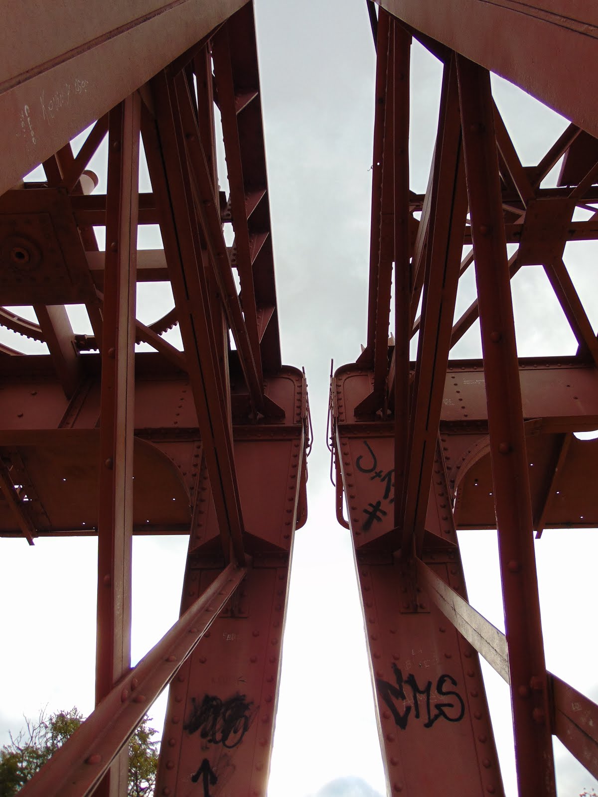
This is a metal structure of the coast of Rosario. The photo looks somehow majestic because of the contrast between white (a more common and relaxing color) and red (a more rare color in nature). It's an interesting combination of tones, and it makes you feel a false sensation of relaxation. Because we are comfortable with this two colors, but we want to know more about the surrounding and the other colors. See more of this combinations. This idea is a little too sentimental, but, for some, it can be frustrating not knowing what it's behind the vail. For others, it may be exciting having only a glimpse of what the world is about and constructing their own one form there.

I took this on the road, and it caught my attention because of the resemblance to a scene from Stranger Things. Maybe when the kids look up to the sky, or when they are showing a shot of Joyce's house. Point is, the sky plays a big role in my photos. And, in this case, even if it is only the background, it sets the scene and the atmosphere so well some even asked me where I took the photo. That means even the background things are essential at the moment of taking a photo and also, when we are looking at life itself. The use of grey and the light coming from behind the clouds generates mystery. It also helps that the foreground colours are more vibrant and contemporary, showing contrast between nature and society, and in a perspective in which both can exist, in harmony, at the same time.
----------------------------☆-----------------------
Conclussion:
In conclusion, you don't need much to take good photos. You don't need to travel to far places to observe interesting things. But, what you must do is to see more than what meets the eye. In other words, stop taking only selfies.
There is no science to this. Just practise. Of course, you can take part in different courses but that would only help you improve technique. The rest is up to you.
You'll find your photos get better and better as soon as you start motivating an practising your observation skills. It can lead to satisfying results. And, for me, there's nothing like going outside and taking photos. It's a great way to connect with your roots and to learn more about nature and the things that surround you.


Comentarios
Publicar un comentario